Shipfaster: UI Components
Chips
Overview
Chips are small blocks of information or controls that enable users to enter information, make selections, filter content, or trigger actions. They provide a way to display tags, social media handles, or any small set of information in a compact format. Chips can also be interactive,such as removing a tag or launching a search based on the chip's content.
When to use
- When you want to present multiple compact options or tags that do not require a full button or control.
- In forms where users can select multiple attributes from a set, such as selecting the traits of a product.
- To display metadata like email recipients or the tags associated with an article.
Anatomy
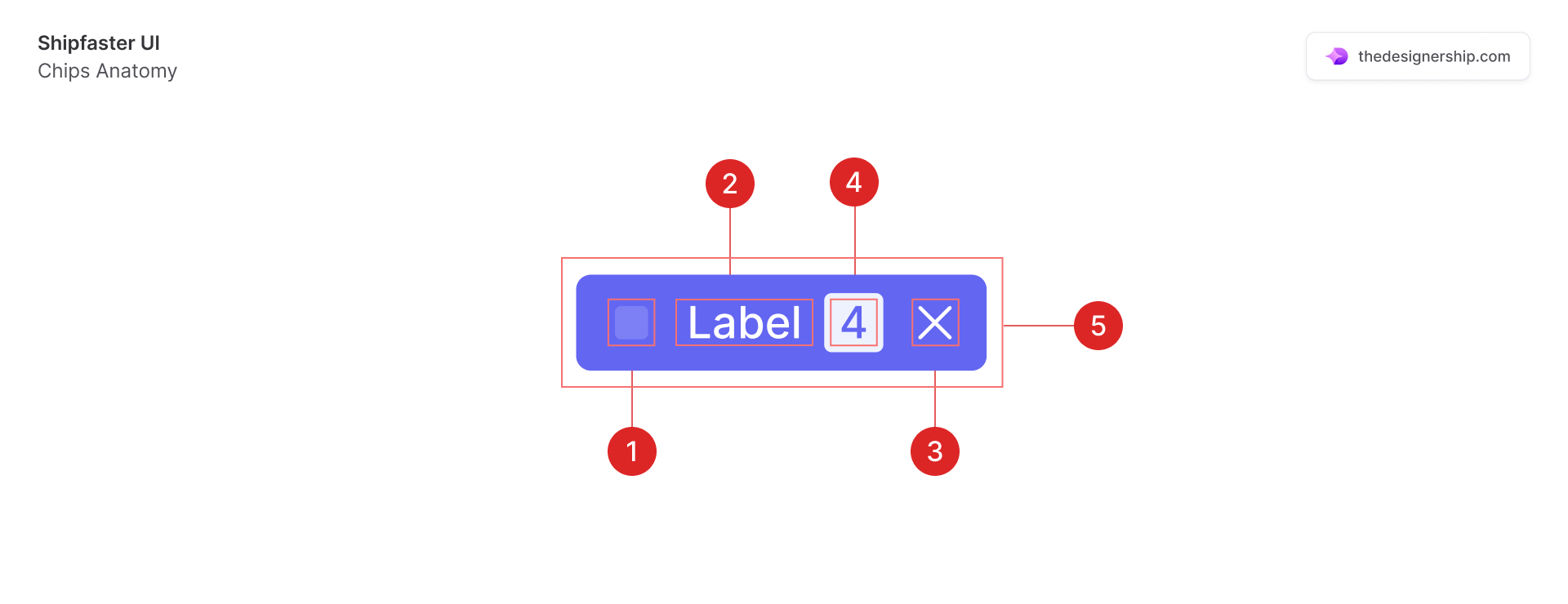
- Icon (optional): An optional leading or trailing icon to represent the chip’s action or category.
- Label: The text content of the chip that describes its value or action.
- Close: Allows users to dismiss or remove the chip from view. It is often used to delete tags or selections.
- Counter: A quick numerical reference of items or notifications associated with the chip.
- Container: The visual element that groups the label (and icon) together, usually styled distinctly to stand out.
Best Practices
- Keep it relevant and focused: Chips should be closely related to the content or task they represent. They should also make tasks easier to do and help with sorting content.
- Clarity in labels: Ensure that the text within a chip is concise and clearly communicates its purpose or value.
- Interactive feedback: Provide visual feedback when a chip is interacted with, such as a change in color or elevation when clicked.
- Avoid clutter: Do not overcrowd the interface with too many chips. They should aid in interface cleanliness, not detract from it.
- Dismissibility: If chips represent user choices, make sure they can be easily dismissed or removed, usually with a clear icon.
- Accessibility: It’s ideal for chips to have sufficient contrast and are accessible to screen readers, with proper ARIA attributes if necessary
Recommended resources
Get instant access to over 6,000 Figma Components with Shipfaster UI. A Figma UI Kit & Design system used by over 2,000 designers.


.svg)


Oops! Something went wrong while submitting the form.